The colors that you bring into your items do impact the brand, along with their recognition and understanding of such items. For some customers, three colors that are in place mean a lot, and it can make or break many sales.
Some customers like the packaging more when colors are involved, for they show the person who is buying it just what types of energy the packaging might have.
Here, we’ll go over what it is, and how companies are using color psychology within packaging to influence, from the warehouse to the consumer overall.
The Use in Retail Packaging
Color manipulation is used in a lot of different ways.
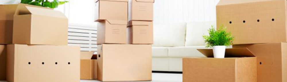
When choosing boxes for example, you might choose one that’s got a certain color to it. That’s because it might excite the customers. For example, green for something that’s sustainable, or purple for luxury.
Tape is the same way. boring old scotch tape might work for a generic shipment, but companies looking to take this to the next level will use a color that best fits them.
The same goes for the filler. You want to choose a filler, such as tissue paper, that complements the box. Otherwise, it might look jarring.
Again, all of these are used strategically, even labels, which in turn will come together to offer a better, more intuitive form of packaging for you, and for the customers.
Popular color trends
These days, trends are all that matter. Eeco tones are good for those packaging incentives that offer sustainability.
Another one is metallics, because they show off the luxury, or high-end aspects of things.
Finally, there is also neon, or brighter colors, which can signify urgency, and get customers to make decisions regarding their packaging.
The benefits of Such Packaging

Color psychology is wonderful for improving branding and other opportunities. By enhancing your branding, you build a better, stronger name for yourself that really stands out.
It also supports the marketing goals that are there. Sometimes, you have to offer a unique incentive and perspective for such marketing efforts, which is why color psychology is the way to go, since it gives these customers something unique.
Finally, it improves the unboxing that’s done. You want to consider this, because a lot of brands thrive on unboxing, so when you do this, it will get them to show it off, and share with others.
Again, all of these come together, in order to support and build an even better, more exciting packaging experience.
Design Insights

The best thing for you to do if you are looking to offer this, is to align your packaging color with the product category and target audience. Again, if your audience is high-end customers, then you will want to try to use blues, purples, or more sleek, neutral colors. If your audience is more eco friendly types, greens and browns, along with earth tones might be good, for it showcases sustainability. If the audience is children, you might want to use bright, whimsical colors that complement each other. all of these can be used interchangeably. Adding some more neutral accents might also be good so that it’s not super overwhelming for everyone that’s there.
Color matters so much to you as a brand, and to your customers. Doing this can influence a lot, and there’s a lot of fun ways not only for your packaging to stand out and really shine, but to also wow the customers you’re looking to really showcase to, and enhance in their own ways a focus that might be useful.